
Timber's Fastest Asset
World Tree Technologies is using a quick-growing hardwood to compress decades-long timber cycles into an investable real estate timeframe
World Tree Technologies is using a quick-growing hardwood to compress decades-long timber cycles into an investable real estate timeframe

The investor intelligence platform for GPs raising capital from PERE, family offices, and RIAs. Now with a live API, real-time Signals, and direct CRM integrations.
Supply, prices, rate lock-in, and migration — ten charts on the US housing market and what each trendline means for operators making decisions right now.

Today's Thesis Driven is a guest letter from Aziz Sunderji, formerly a strategist at Barclays Investment Bank and a WSJ reporter. He now writes the housing newsletter Home Economics. He created all of the data visualizations in this piece.
Real estate rarely moves in a straight line. Some parts of the market have normalized after the disruptions of the pandemic and subsequent financial upheaval. Others are still adjusting, and a few are beginning to change in ways that may prove fundamentally structural rather than cyclical.
Housing sits upstream of many of these shifts. It shapes migration patterns, household formation, land use, and ultimately the demand profile for nearly every other asset class. When housing changes, the rest of real estate tends to follow, often with a lag.
To better understand what is actually happening, we stepped back to look at the data. The charts that follow highlight several of the most important forces shaping the market today: diverging home prices, the durability of the suburban premium, slowing population growth, shifting migration patterns, and affordability pressures that are reshaping when—and whether—households form.
Taken together, they describe a market that is neither booming nor collapsing, but fragmenting—increasingly defined by local conditions, demographics, and macroeconomic change.
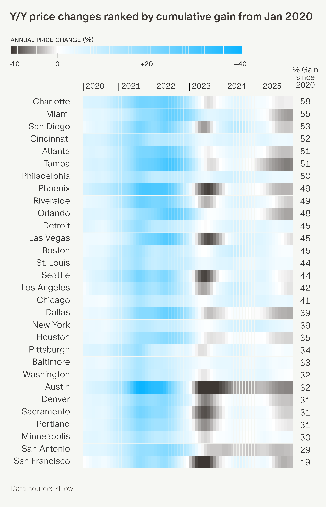
1. The Big Picture: Home Prices 5 Years After Covid
The pandemic reshaped the housing market through new migration patterns, near-zero interest rates, and a surge in transactions. Home prices across major metros surged in 2021–22, fell amid high mortgage rates in 2023, and have been flat or slightly negative since. But there’s no single trend line here. For example, Charlotte and Miami rallied hard but didn't give much back; Minneapolis never rose much or fell much. Florida metros tumbled through 2025 due to surging insurance costs, return-to-office shifts, and departing Canadian snowbirds—yet Miami and Tampa remain among the best performers measured from January 2020.
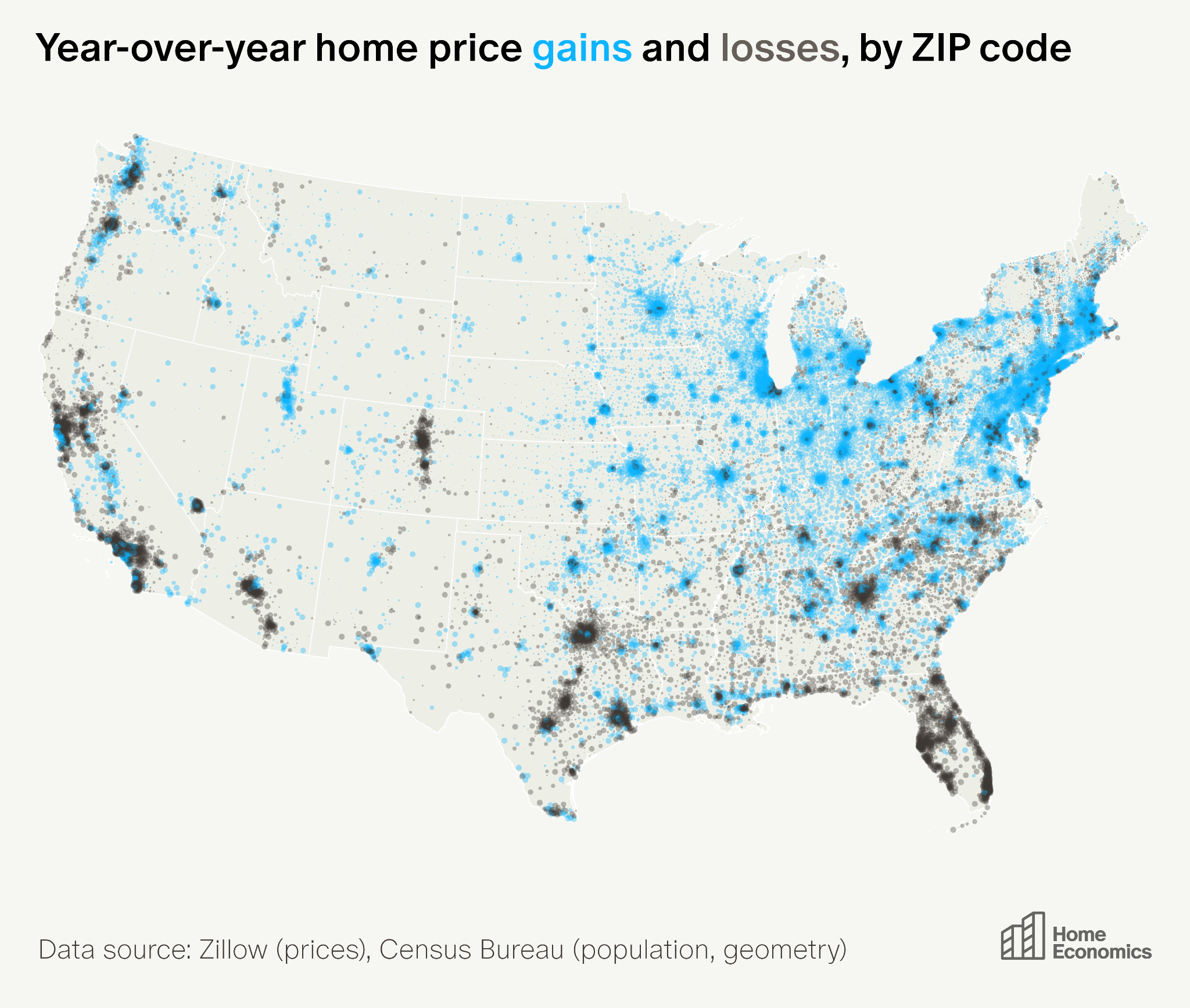
2. Home Price Momentum Today: A Bifurcated Market
In 2025, home prices rose year-over-year in 16,500 ZIP codes (63%) and fell in 9,800. Housing price appreciation in the US has become a tale of haves and have-nots. Gains concentrated in the Midwest and Northeast—over 85% of ZIP codes in Wisconsin, Indiana, Connecticut, and Illinois saw appreciation. Losses dominated the Sunbelt: Florida (96% of ZIPs), Texas (75%), Arizona (73%), and California (78%) saw widespread declines. The divergence reflects national appreciation hovering near 0%, producing a mix of gainers and losers, plus unusual local forces—rising insurance, pandemic-era overbuilding, and return-to-office migration—dragging down the Sunbelt.
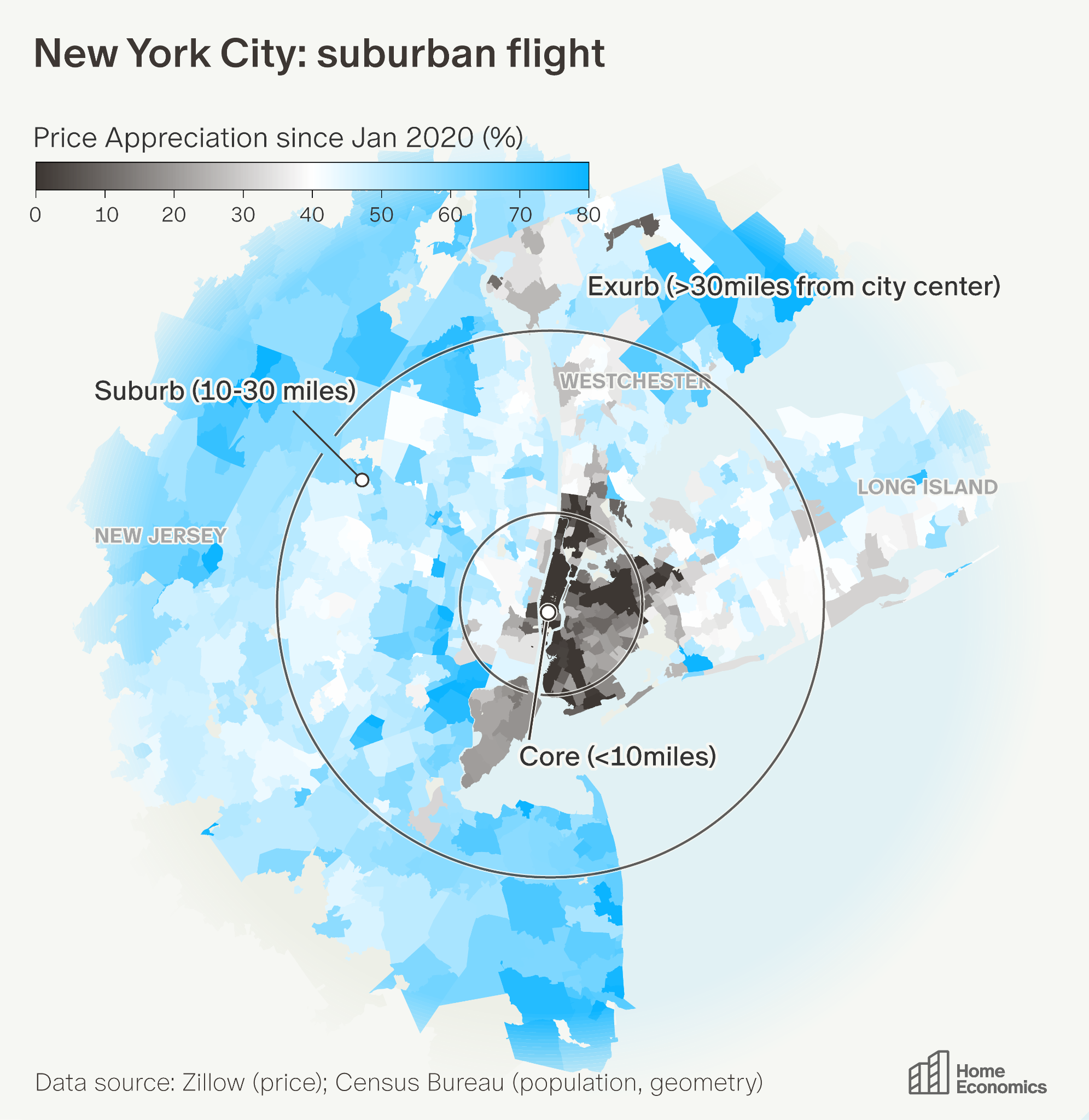
3 & 4. The Suburbs are Back
Home prices in suburbs and exurbs have risen far faster than city cores since Covid, with the widest gaps in the country's two largest metros. New York's 48-point urban-exurban gap leads the nation, while San Francisco's 37-point gap ranks second. The pattern is consistent: urban cores stagnated or fell, suburbs gained modestly, and exurbs soared.
In New York, the urban core (within 10 miles of Midtown) rose just 11%; Manhattan itself fell 10%. Suburbs gained 46%, while exurbs in the region rose 60%. The biggest winners were remote-work retreats within driving distance: the Catskills (Monticello +123%), the Poconos (Bushkill +110%), and the Jersey Shore (Allenhurst +135%).
In San Francisco, the urban core (within 10 miles of downtown) fell 7.5%; downtown neighborhoods fared even worse, with SoMa down 25% and the Tenderloin down 23%. Suburbs gained 24%, while exurbs rose 30%. Winners include San Ramon (+54%) and Danville (+49%) along the I-680 corridor, plus coastal retreats like Stinson Beach (+46%).
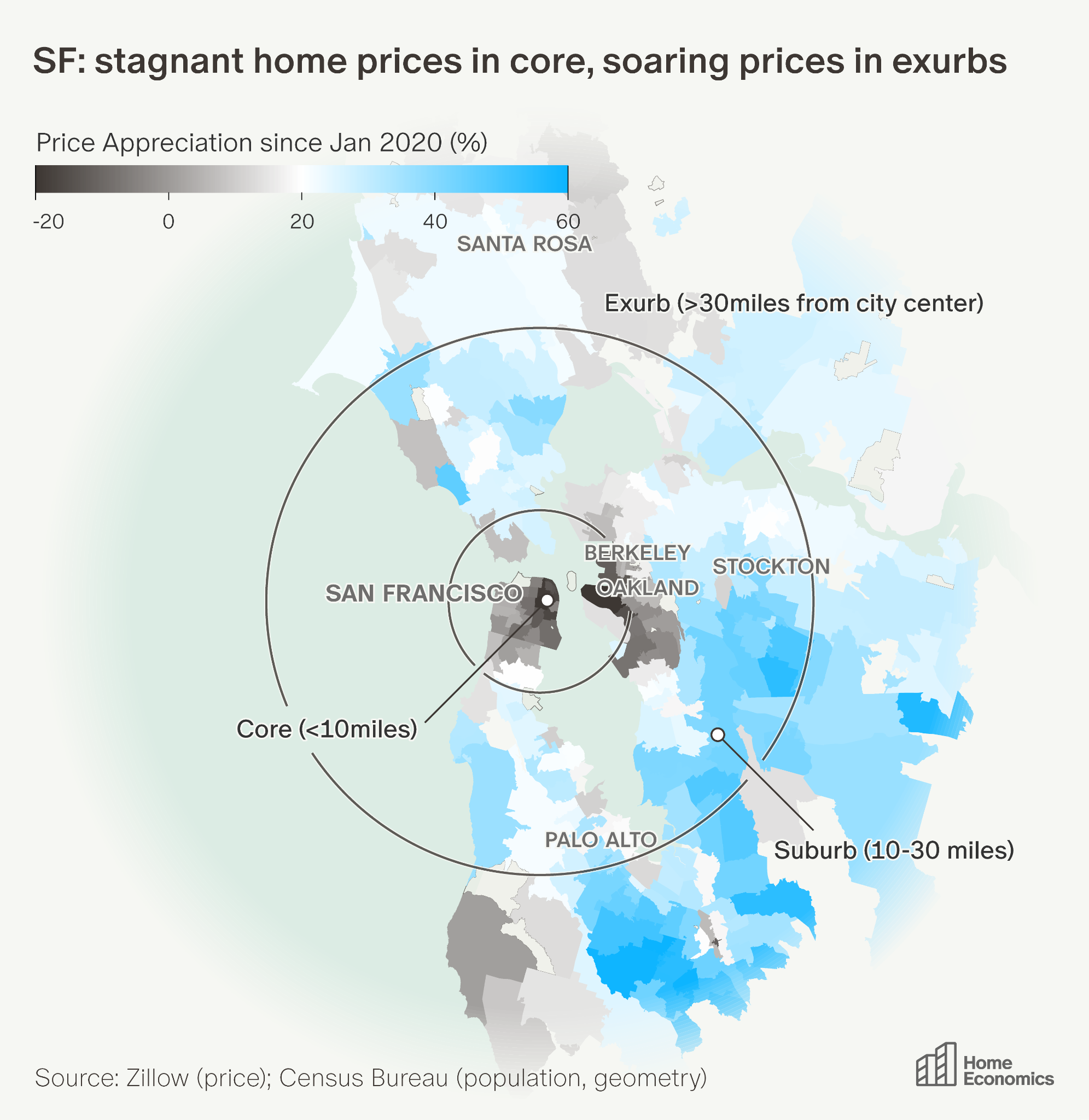
We’re five years post-Covid, and despite return-to-office mandates, the exurb premium continues to rise in New York and remains stable in San Francisco. If urban vs. suburban relative valuations haven't returned to pre-pandemic levels by now, they may never.
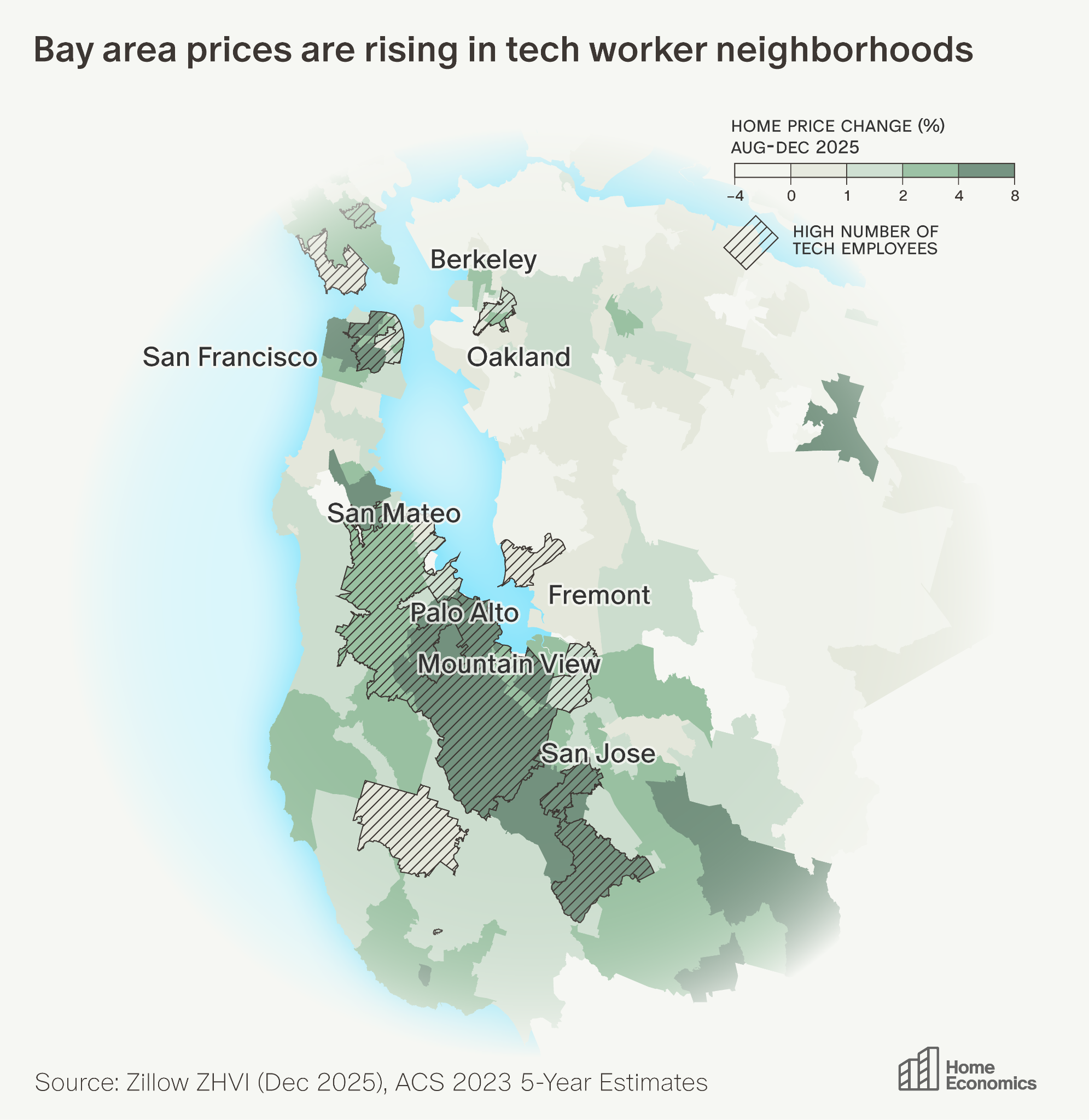
5. The AI-Powered Silicon Valley Rebound
Silicon Valley employees of OpenAI, Anthropic, and Perplexity are using secondary share sales to fund home purchases, fueling a housing rebound. In mid-2023, San Jose ranked third-worst among 100 metros for year-over-year home price growth; by late 2025, it climbed to 20th. Between August and December 2025, Mountain View gained 7.2%, Los Altos 6.7%, Palo Alto 6.1%—all with information sector employment above 7%. San Jose’s average private-sector wages hit $3,867/week in mid-2025, up 44% from 2019. The rebound combines a turning point in tech job losses, AI-era equity gains, and a valuation correction.
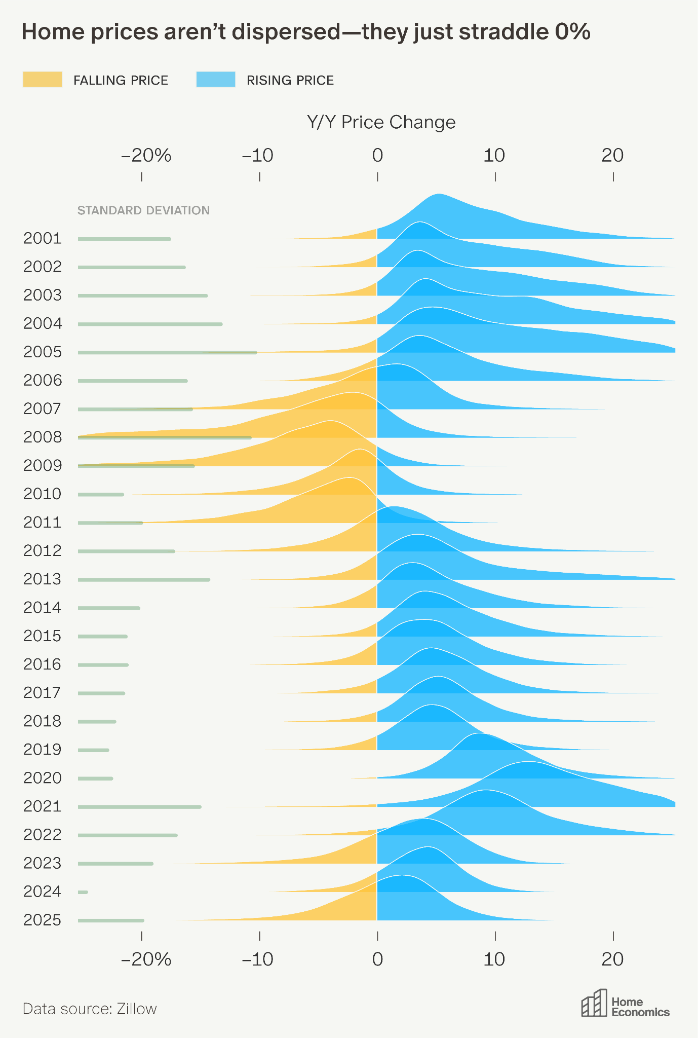
6. Is this a Weird Housing Market? (Yes)
Just how divergent is today's housing market? The ridge plot shows the distribution of year-over-year price changes by ZIP code since 2001. The spread (standard deviation) of price changes is actually below average—it's not that prices are rising a lot in some places and falling a lot elsewhere. What's weird is that the mean sits near zero (typical years average close to 5%). A normal distribution straddles this average, producing a mix of risers and fallers even without unusually high dispersion.
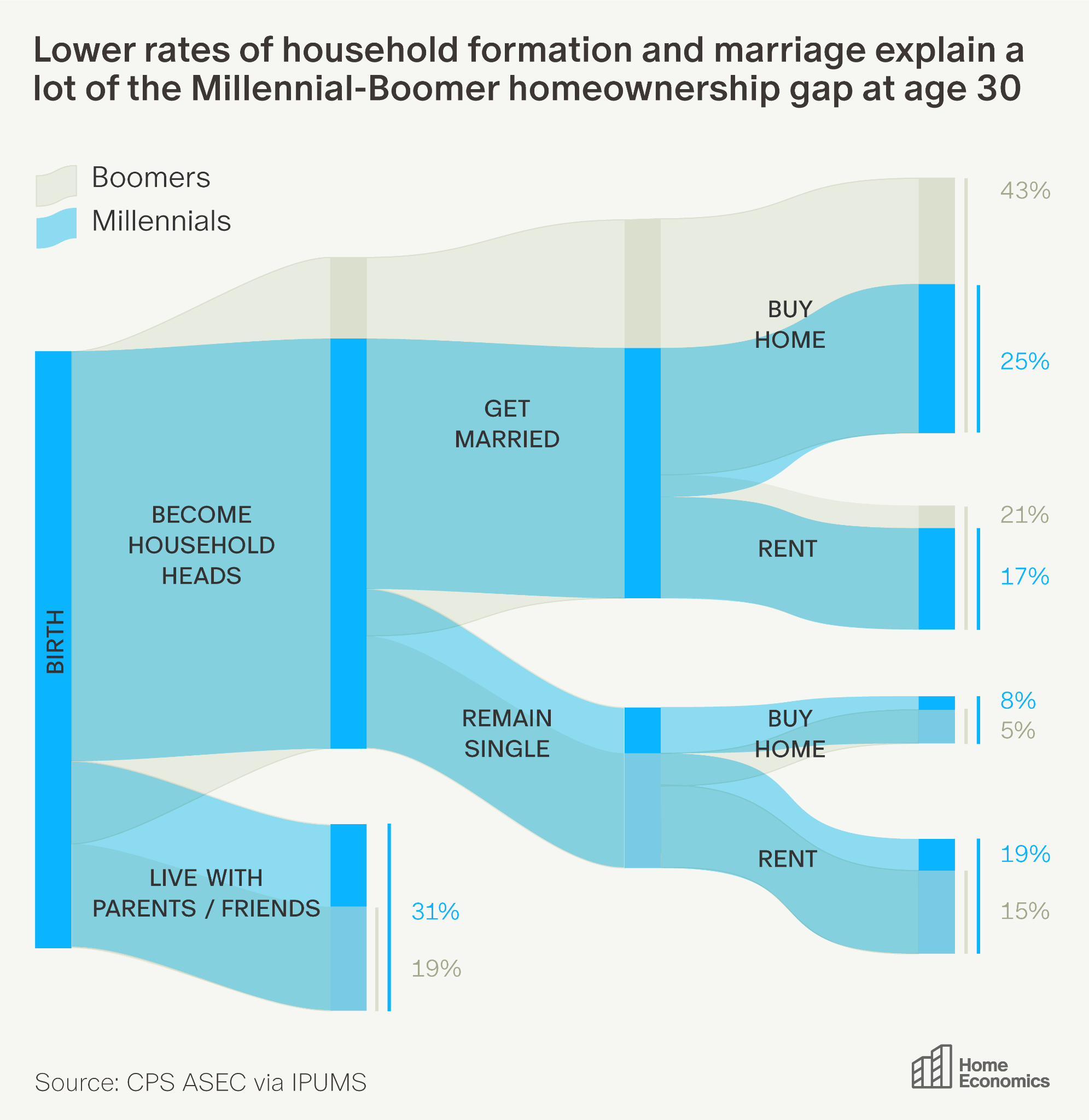
7. What Explains Low Millennial Home Ownership?
It has become clear that comparatively few Millennials own homes relative to prior generations. But why? A Sankey diagram traces the path from birth to living arrangement at age 30 for Millennials and Boomers. Two junctures reveal where generations diverged: first, more Millennials stayed with parents into their 20s rather than forming independent households; second, among those who did leave, fewer transitioned to homeownership by 30. The result is that at age 30, 48% of Boomers owned homes compared to just 35% of Millennials. Delayed household formation and higher barriers to first-time buying both play roles.
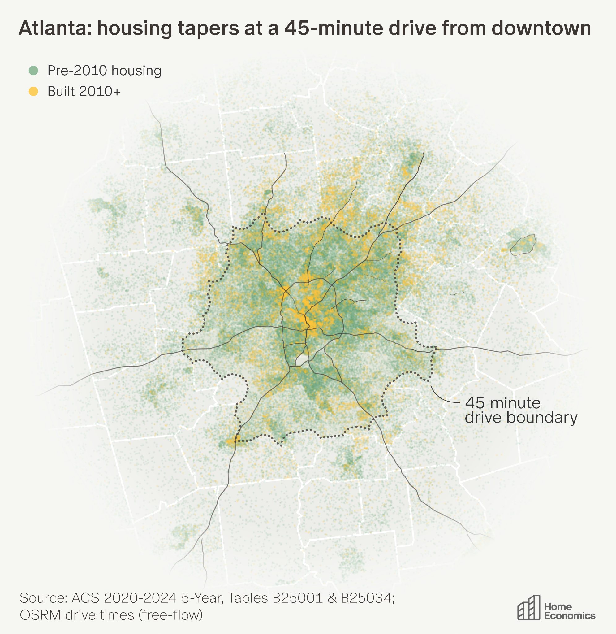
8. The Atlanta City Limits Slowdown
Atlanta's housing stock grew 4.8% in the 1970s, but by the 2010s that rate had fallen to 1.1%—just 0.6% in 2020–23. The same slowdown appears across Sunbelt cities, including Phoenix, Dallas, and Miami. A dot-density map reveals why: dense construction fills the 45-minute commuter envelope from downtown, then drops off sharply at the edge. The Atlanta metro has 2.5 million housing units; 70% sit within the 45-minute line. Cities like Atlanta grew by sprawling outward, but they've largely exhausted buildable land within commuting distance. Atlanta car commuters already face the second-longest average commutes nationally. The city is now densifying: the highest concentration of post-2010 construction is urban infill downtown.
9. US Population Growth Slows to a Crawl
The U.S. added just 1.8 million people between July 2024 and July 2025, with only 519,000 from natural increase (births minus deaths). International migration fell 54% year-over-year to 1.26 million—still double the 2019 rate. Florida (+179K), Texas (+167K), and California (+109K) received the most immigrants. Domestic migration still redistributes Americans southward, but more slowly: North Carolina (+84K), South Carolina (+67K), and Texas (+67K) led gains. Meanwhile, California (-229K) and New York (-138K) led losses. Florida's domestic inflow collapsed from 311,000 in 2022 to just 22,500 in 2025. Natural increase has collapsed: before the pandemic, deaths exceeded births in 5 states; in 2025, that number is 18.
10. The Price of Endless Summer
California lost 254,000 residents to other states in 2024 on a net basis—double the 2010–2019 average of 125,000. Top destinations: Nevada (+32K net), Texas (32K), Arizona (24K), Florida (20K). The composition is shifting: high-income households ($150K+) now make up 23% of departing household heads, up from 12.5% in 2011–2019. Employment-related moves dropped from 48% to 33%, while housing/cost concerns rose from 22% to 31%. High earners citing "cheaper housing" nearly tripled from 7% to 20%. California's housing crisis has reached so far up the income ladder that even affluent households feel priced out.
Investors and operators reading the market through charts like these go deeper in Thesis Driven's workshops. The Operator Database maps the owners and developers acting on these trends.

Falling birth rates, shifting migration, and an aging population are already reshaping demand across real estate, faster than most of the market has priced in


How a generation of superstar chefs and obsessed diners remade urban neighborhoods, inflated rents, and priced themselves out of the streets they made desirable.

How autonomous vehicles will break the economics of convenience retail


Stacks of documents, repetitive workflows, and massive economics make mortgage lending an obvious target for AI, but adoption has been slow.
Covering the future of real estate and the people creating it